Time, Texture and a Few Thoughts

Happy Day Light Savings Time week, Americans! Funny how that one hour time change makes everything feel so weird during the first few days. The time change is giving me a little extra morning studio time before leaving for work.

Here are a few practices in watercolor texture for Fall. If you have watercolors, I encourage you to pull them out, pour a cup of tea and play.

Saran wrap, applied on wet paint and allowed to dry

Saran wrap, applied on wet paint and allowed to dry

Wet in to wet. Color drops allowed to blend and do their own thing.

Wet in to wet. Color drops allowed to blend and do their own thing.

Gauze! Probably one of my personal favorites. Place upon wet paint or paint over without moving it and allow to dry

Gauze! Probably one of my personal favorites. Place upon wet paint or paint over without moving it and allow to dry

Scratches with the end of a paintbrush

Scratches with the end of a paintbrush

Drawn wax circles, then painted over

Drawn wax circles, then painted over

IMG_0247.JPG

Due to said time change, I find myself struggling to stay awake past 8 in the evening...and that leaves me thinking about time.

The realities of the time constraints working full time have been evident. But ultimately, we all have the same amount of time in each day. It's how we choose to use it that matters. 

My choices include trying to wake up early in the morning, while the moon is still out. Reading more and swimming whenever I can. (OK that's a lie, sometimes I make excuses and don't go the gym...But at least I still think about swimming on a daily basis.)

I've also recently decided I'd follow only one social media platform and let the others go.  More time offline is going to be a new luxury I gift myself this holiday season. 

The biggest struggle for me in all of this though is my inability to stop working on a task when it's time to put something down. I simply don't like to leave things unfinished. Often ignoring the constraints that time provides for the sake of balance.

“The future is something which everyone reaches at the rate of sixty minutes an hour, whatever he does, whoever he is.”
― C.S. Lewis

Carpe Diem! 

Meet Your Friend, Watercolor Part 1

Watercolor is a good friend. She is quiet and listens well. Because she demands patience and a gentle touch, she tends to quiet the soul. And she doesn't require much. She is quite happy with a glass of water and a little air. Add a sprinkle of salt and watch magic happen.

Some don't understand her. But they just haven't gotten to know her.

So please, let me introduce you to my friend, Watercolor. You should know that, sometimes she spells her name with a "u"... Watercolour. :-)

All personification aside, (and hopefully you haven't hit unsubscribe because of it) - I am currently teaching a small watercolor intensive to a few friends. While I've taught afterschool art to children, I have never taught watercolor to adults. At one point in college my major was art education, but I realized very quickly that it takes a special kind of bird to teach art.

I tend to loose my words while I am painting, so to do a demonstration and explain what I am doing at the same time is really hard for me. It's as if adding the process of painting into this bilingual brain, jumbles all my words and sends them on vacation. And then some things in the creative process are simply hard for me to explain. 

However, I am enjoying finding those words so that I can share something I love so much with others.

While nothing can compare to active learning in a class setting, if the world of watercolor is of interest to you, I'll be typing a few blogs simply for the sake of sharing more about the medium of watercolor. (And to help me find those art instructional words.)

So here's Part 1.

PAPER & MATERIALS

140lb Kilimanjaro Cold Press Full Sheet

140lb Kilimanjaro Cold Press Full Sheet

On Paper.  The kind you get matters. It's like a PB&J versus steak dinner kinda difference. Full sheets typically require stretching, unless the paper is a heavy weight. Stretching is basically, wetting the paper completely, securing it to a surface and then letting it dry.

Watercolor paper typically comes in the following weights. 90lb, 140lb and 300lb. 90lb is student grade. 140lb is probably the most popular due to quality and price. 300lb is thicker and does not require stretching. It's almost like cardboard. I typically paint on 140lb.

What does weight mean? A manufacturer will weigh a ream of 500 sheets of paper in its uncut state and gives it a number to indicate the paper’s weight. Weight indicates the quality (and usually the price) of the paper.

Texture describes the surface finish on paper. Texture can help define the character of the painting.

Hot press: smooth and slick surface. It doesn’t allow for as soft of color transitions. Good choice for detailed and illustrative work.

Cold press:  What I most use. Water absorbs well and allows for many techniques.

Rough: Bumpier surface than cold press. Good choice for textural surfaces like rocks and such.

WATERCOLOR BLOCKS

A watercolor block is a stack of watercolor paper that is attached together. The sheets of the paper are trimmed to size and then stacked upon each other. That stack of art paper is then attached to a backing board with a padding glue. This glue is applied to all four sides of the paper. These don’t require stretching. You will find an opening at the top of the gummed pages. Peel your completed paper off the stack when you are done.

AQUABORD

This is a fairly new and interesting surface to work on. It allows for the lifting of watercolor and for much more room of error than paper. However, it does not absorb the water and pigment in the same way as paper does. Ampersand makes these.


PAPER BRANDS

Arches Paper has been around since 1492. It is high quality and has an interesting history.

Fabriano is also high quality and lovely paper.

Kilimanjaro paper is another brand with nice quality. You can find it online at places like Cheap Joes.


PAINTS

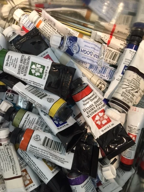
I now LOVE Daniel Smith watercolor paints! But many other manufacturers make high quality lovely paints. Winsor Newton offers high quality paints and also a few tutorial videos on their sight.

Quality will matter, but I do not recommend that a beginner break the bank on paints.

Colors. You will want a blue, red, yellow, green, probably Raw Sienna and Payne's Grey. But honestly, there are SO many colors to choose from! I prefer to let students experiment with various colors to find those that resonate most with them. My most favorite color is Payne's Grey. Greens can be tricky. I like Sap Green best. A Hansa or Cadmium yellow is good. As far as blues, I like a Winsor Blue with Red Shade and a French Ultramarine. And Daniel Smith Pyrol Orange is a new favorite color.

If you are new to watercolor you will want a palette with a cover if you use tube paints. You simply cover what you haven't painted with and reuse. reuse. reuse. reuse. These paints really go a very long way.

If you'd like to know more, here is a great blog entry about watercolor paints, pigments and why the good stuff costs more.

OTHER SUPPLIES / MATERIALS

Masking fluid, brushes (round and flat), paint pallet, sponge, salt, saran wrap, gauze, gator board, staple gun, painter’s tape, pencil, eraser, tracing paper, paper towels. More about them later.

Giving credit, where credit is due.  My watercolor knowledge came later in life for me. From the kind and thorough instruction of Tom Herzog.

In college, I thought I was too cool for watercolor and only hung out with Oil, Acrylic and Screenprint. I now know who the real cool kids are. I am forever grateful for the opportunity to learn about the medium of watercolor.