Meet Your Friend, Watercolor Part 1

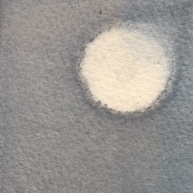
Watercolor is a good friend. She is quiet and listens well. Because she demands patience and a gentle touch, she tends to quiet the soul. And she doesn't require much. She is quite happy with a glass of water and a little air. Add a sprinkle of salt and watch magic happen.

Some don't understand her. But they just haven't gotten to know her.

So please, let me introduce you to my friend, Watercolor. You should know that, sometimes she spells her name with a "u"... Watercolour. :-)

All personification aside, (and hopefully you haven't hit unsubscribe because of it) - I am currently teaching a small watercolor intensive to a few friends. While I've taught afterschool art to children, I have never taught watercolor to adults. At one point in college my major was art education, but I realized very quickly that it takes a special kind of bird to teach art.

I tend to loose my words while I am painting, so to do a demonstration and explain what I am doing at the same time is really hard for me. It's as if adding the process of painting into this bilingual brain, jumbles all my words and sends them on vacation. And then some things in the creative process are simply hard for me to explain. 

However, I am enjoying finding those words so that I can share something I love so much with others.

While nothing can compare to active learning in a class setting, if the world of watercolor is of interest to you, I'll be typing a few blogs simply for the sake of sharing more about the medium of watercolor. (And to help me find those art instructional words.)

So here's Part 1.

PAPER & MATERIALS

140lb Kilimanjaro Cold Press Full Sheet

140lb Kilimanjaro Cold Press Full Sheet

On Paper.  The kind you get matters. It's like a PB&J versus steak dinner kinda difference. Full sheets typically require stretching, unless the paper is a heavy weight. Stretching is basically, wetting the paper completely, securing it to a surface and then letting it dry.

Watercolor paper typically comes in the following weights. 90lb, 140lb and 300lb. 90lb is student grade. 140lb is probably the most popular due to quality and price. 300lb is thicker and does not require stretching. It's almost like cardboard. I typically paint on 140lb.

What does weight mean? A manufacturer will weigh a ream of 500 sheets of paper in its uncut state and gives it a number to indicate the paper’s weight. Weight indicates the quality (and usually the price) of the paper.

Texture describes the surface finish on paper. Texture can help define the character of the painting.

Hot press: smooth and slick surface. It doesn’t allow for as soft of color transitions. Good choice for detailed and illustrative work.

Cold press:  What I most use. Water absorbs well and allows for many techniques.

Rough: Bumpier surface than cold press. Good choice for textural surfaces like rocks and such.

WATERCOLOR BLOCKS

A watercolor block is a stack of watercolor paper that is attached together. The sheets of the paper are trimmed to size and then stacked upon each other. That stack of art paper is then attached to a backing board with a padding glue. This glue is applied to all four sides of the paper. These don’t require stretching. You will find an opening at the top of the gummed pages. Peel your completed paper off the stack when you are done.

AQUABORD

This is a fairly new and interesting surface to work on. It allows for the lifting of watercolor and for much more room of error than paper. However, it does not absorb the water and pigment in the same way as paper does. Ampersand makes these.


PAPER BRANDS

Arches Paper has been around since 1492. It is high quality and has an interesting history.

Fabriano is also high quality and lovely paper.

Kilimanjaro paper is another brand with nice quality. You can find it online at places like Cheap Joes.


PAINTS

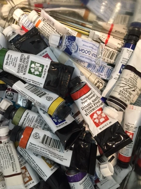
I now LOVE Daniel Smith watercolor paints! But many other manufacturers make high quality lovely paints. Winsor Newton offers high quality paints and also a few tutorial videos on their sight.

Quality will matter, but I do not recommend that a beginner break the bank on paints.

Colors. You will want a blue, red, yellow, green, probably Raw Sienna and Payne's Grey. But honestly, there are SO many colors to choose from! I prefer to let students experiment with various colors to find those that resonate most with them. My most favorite color is Payne's Grey. Greens can be tricky. I like Sap Green best. A Hansa or Cadmium yellow is good. As far as blues, I like a Winsor Blue with Red Shade and a French Ultramarine. And Daniel Smith Pyrol Orange is a new favorite color.

If you are new to watercolor you will want a palette with a cover if you use tube paints. You simply cover what you haven't painted with and reuse. reuse. reuse. reuse. These paints really go a very long way.

If you'd like to know more, here is a great blog entry about watercolor paints, pigments and why the good stuff costs more.

OTHER SUPPLIES / MATERIALS

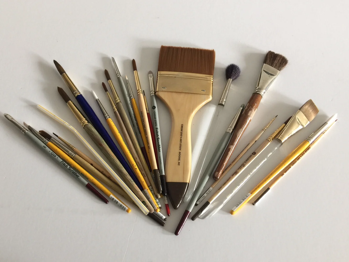
Masking fluid, brushes (round and flat), paint pallet, sponge, salt, saran wrap, gauze, gator board, staple gun, painter’s tape, pencil, eraser, tracing paper, paper towels. More about them later.

Giving credit, where credit is due.  My watercolor knowledge came later in life for me. From the kind and thorough instruction of Tom Herzog.

In college, I thought I was too cool for watercolor and only hung out with Oil, Acrylic and Screenprint. I now know who the real cool kids are. I am forever grateful for the opportunity to learn about the medium of watercolor.

Bird Squares & Gradebooks

It was teaching in the classroom that taught me the importance of observation.

It's there that I learned how much the posture and mannerisms of a child can tell you about their confidence, their false sense of confidence, and how hard it can be to simply be a kid these days...especially in middle school. Since then, I've learned to spot some of these insecurities in adults now a bit too. It's masked in different ways, but some of those things from back then are still there in our older versions of ourselves.

And that's why I love watching these little birds so much. I find, they can mimic human behavior in such funny ways.

This summer I have been plowing through a series of little bird squares, because I've been thinking through some things that actually relate to the classroom. And as I painted, it seemed a certain refrain, albeit taken a little out of context, from a song by the Clash was my prayer...

Well, come on and let me know
Should I stay or should I go?
Should I stay or should I go now?

Because you see, at the end of last school year, I received a few phone calls and emails asking me if I would please consider returning to the classroom due to a vacancy that had arisen. Pause.  My self imposed mini-retirement, my stay-at-home college mom life, being wife to LLC freelance design life has been delightful! I have had quiet and glorious amounts of time to assess my values and priorities. I've made swimming a habit, my house is in the kind of order only a German Hausfrau can achieve, I've been painting some interior spaces, visiting family and friends, painting and just this week began a little watercolor instruction class for adult art students.

Why in the bloody hell would I even consider returning to public education? - Where you can't just go to the bathroom whenever you might want. (It's a whole thing, to discreetly make sure a teacher can watch the kids,  so no one pokes someone's eye out with a pencil, while you tend to your business....) - Where the job pays so well, especially in South Carolina. (sarcasm) -  Where sometimes creatively and diplomatically you must prove to parents and administration, that you have taught the material upside down, sideways and back again, because some how, you the teacher are 100% responsible for the child's learning. (#studentresponsibilty please)- And where teaching trends, educational politics and philosophies can change faster than the wind, just when you mastered the latest thing...

I'm sure you can see where this wordy blog post is going, by now...

In my interview the phrase, "Once a Teacher, Always a Teacher" was mentioned. And I thought huh, wonder if that's true?

Because I have been doing German grammar exercises for fun during the past few months. Weird I know, but true... And when I was a child, my sisters and I always played school and guess who was always the teacher? And I happen to love teaching middle school. They are my favorite kind of kid. And if I am going to voice an opinion about the state of education, what am I doing to help it? Because angry words are often so very many - but action is limited. Oh, and not to mention, I do love an old-fashioned gradebook. And I can spend 4 hours over coffee discussing German teaching strategies with Lucia Huang, master jedi of all German teachers.

I also knew that when I went back to work, I wanted whatever I did to match the academic calendar Charles's work follows. We had our children very early, so we knew then, that many of the adventures we wanted to take would need to wait until our children were older.  And well, that time is here and a priority.

Because of the things society tends to value, it may seem a little backward to some going from the title of executive director to that of teacher again despite a few other opportunities. But I've given much thought to what matters to me as a person most and where my strengths lie. So the decision to go back "into the trenches of public school", if you will, feels right for this season.

So all that to say, I have spent the past few weeks preparing to return to the classroom!!! But I have also been pursuing accountability so that I will continue to paint consistently and meaningfully.

And if you happen to still be reading...I do want to point out that I do not view teaching as a calling. It is a job and quite frankly hard work. Please stop telling teachers they have such a high calling and using that type of language. It makes the fact that they work so hard, for very little pay, seem well, kosher.

Instead, perhaps let them know how much you appreciate what they are doing. Support and advocate for them!  Work to raise the pay for teachers in South Carolina and you will see professionals and educated individuals who have solid knowledge of the content enter the field and stop leaving. ( I would not be considering this line of work in this state, if I did not currently have the luxury and privilege of financial stability my husband provides our family.)  Please work to improve the physical and structural state of the schools within this region of the state. I am horrified that the images of my high school's pre-demo state, show it in a better shape than many regional schools. And I know you all know that the work in these trenches is great. I'm not trying to point fingers or anything like that...Let's simply make it better, by elevating the profession of educator to what it should be. End of soap box.

So all this to say, I am honored to be pulling out my teacher hat again, to return to work within a district and a program with others that value a globally minded education for all. 

My father always said, "Malala will be free as a bird." -Malala Yousafzai


Escape to Hickory Knob

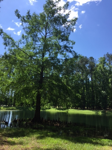
Towards the end of May, I packed my watercolors, camera, a wonderful book and traveled to Hickory Knob State Park in South Carolina.

The South Carolina State Park system has an artist in residency program. This year I had the privilege of participating and it was delightful. It came at the perfect time of the year.

A time before summer schedules and projects begin. And a time when rest and respite is most welcome.

Our family world still revolves very much around an academic calendar. And the end of a semester is when we tend to catch our breaths. Our oldest had completed his first year of college and the youngest was completing his junior year. How did they get so old? So fast?

I was in the midst of some decision making. And well, Charles. He was simply t-i-r-e-d.

So this get-a-way to unplug, observe, learn, create and be inspired was soul filling.

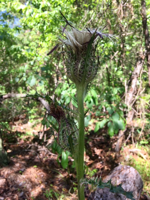
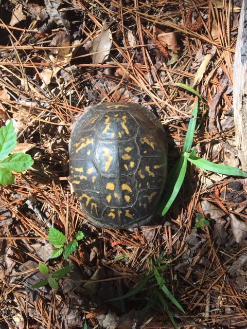
We walked the trails during the mornings. And I took SO many pictures! Some of you may know I took an introductory class in botanical illustration in January. Paired with this book, I was reading at the time, I was on a nature and plant observation high! 

Many of our walks were not so quiet as they were laced with "informative mini lectures" based on the most recent chapter I finished.

During our stay we had a few memorable bird experiences. The pileated woodpeckers were active. One actually hit the window of our cabin, only stunning him for a moment. Long enough for me to capture a few images, though.

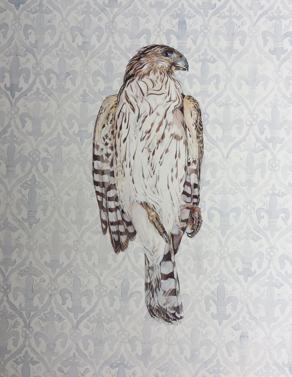
But perhaps most striking was the morning we came upon the hawk, which I chose to paint for the park.

We were so close to him and he didn't seem to mind at all. It was as if he was posing in this most majestic and photogenic manner. And the air was so still, quiet and serene.

A privileged moment.

Hickory Knob State Park, thank you for the oppurtunity.

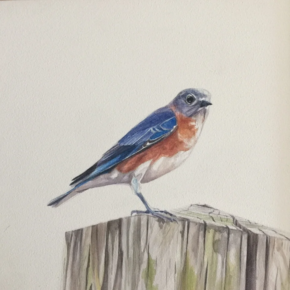
Sialia sialis

"The Bluebird carries the sky upon his back."
-Henry David Thoreau

And so do some of the people in our lives. I was asked to paint this piece as a special gift for a favorite friend who truly is someone that makes you strive to be more than you think you can be.

This happened during the same week as a neighbor passed away so both personalities were on my mind as I painted.

Both educators, both mentors (one to me and the other to my husband), both leading by example and both so very gentle and kind.

Just like the eastern bluebird. Possibly my favorite bird to watch.

It was the discovery of these birds in a bird box in my backyard, left by previous home owners -  that began my love of bird watching. One of my best friends from childhood had collected blue birds. That was my extent of bluebird encounters up to this point.

Not only would I think on the simplicity of childhood as I observed them, but also I began to learn from these blue wings. Things like beauty in flight and purpose. Gentle, yet industrious, hard working and protectors of family, Sialia sialis had much to teach me.

Much like these heaven bearing friends of mine whose songs can carry the rest of us.

SB, you have been such an instrumental part in my life! I hope I can have an ounce of the TRUE southern lady grace you have! Thank you for investing in me and teaching me so much! "Lucille" - I am excited about all your future "tractor and engine" adventures!

Sialia sialiswatercolor on aquabord8" x 8"

Sialia sialis
watercolor on aquabord
8" x 8"

Transparent

I live in a culture of good manners and southern charm. And sometimes that takes away the freedom transparency has to offer. I think about this as I compare the unspoken societal rules of respect and polite manners of small southern town living to German frankness and stoic silence - I am acquainted with both.

I believe all these behaviors, I have lived and interacted within desire simply to extend respect and kindness to the other person. Yet, still these ways of communicating intrigue me.

Where is the balance within me?  this person of two cultures? Feeling at home in both but yet, also a stranger at times.

In considering this, I have taken on another 100 day project on Instagram. (not 100% sure I'll finish this one... ) But I am taking time to revisit a few basic watercolor exercises and becoming reacquainted with my palette through play.

I do find the play on words immensely intriguing as I consider the meaning of transparency in relation to these parts of the following definition . . .

Definition of transparent

  1. 1a (1) :  having the property of transmitting light without appreciable scattering so that bodies lying beyond are seen clearly : 

  2. 2a :  free from pretense or deceit :  frank b :  easily detected or seen through :  obvious c :  readily understood

from https://www.merriam-webster.com/dictionary/transparent

Something to think about.

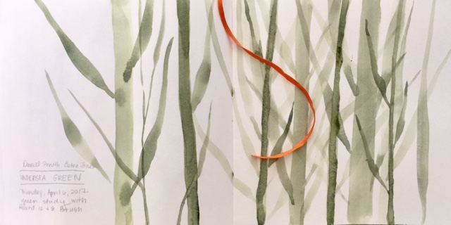
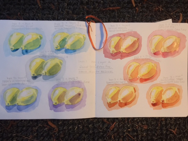
Here are a few images from my first few days as I have explored transparency, layering and how the hues which surround a subject can impact its "personality".

The first being a color study using lemons as the subject matter. 2 layers of hansa yellow medium and then 2 layers of each of the colors explored.

Theses studies are done quickly. Mainly to see and learn what tones and colors are achieved through the layering process.

I don't necessarily like posting such quick, unfinished and messy studies. I would be lying if I didn't acknowledge that my pride feels something should look just so before putting it out there. But I think I am going to try and get past that.

A book I recently read is challenging me in many ways. It references Leonard Cohen's song Anthem:

Forget your perfect offering
There is a crack in everything (there is a crack in everything)
That's how the light gets in

And in order to be transparent, light must get in. Wouldn't you agree?

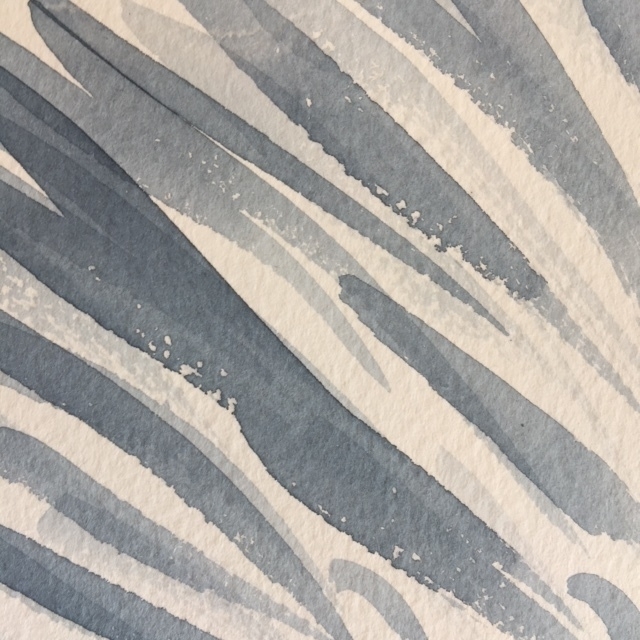
(The transparent studies in Daniel Smith Sap and Undersea Green are studies in applying pressure to the brush stroke and the impact it has in the width of the line.)

*Ok, so only after day 6, of this project, I realized I would be unable to do the 100 days straight AFTER ALL due to upcoming travel (which may or may not have internet access) and other obligations. So for simplicity's sake, I am continuing on with the exercises as I am able, but not with the Instagram posting for the 100 straight days as I had originally planned* 4/9/17